
PRISM PROCESSING
Prism is a women-led, veteran-led cannabis processing facility built on clarity, intention, and care. Their work is rooted in community, wellness, and personal growth, and approach cannabis processing as both a technical discipline and a responsibility to the plant, to our partners, and to the people who ultimately use the product.
SERVICES
Brand Identity
Design
Strategy
The cannabis processing industry has a branding problem. Most operators communicate quality through familiar clichés such as leaf iconography, earthy greens, and approachable-but-generic packaging that flattens the real story. Prism Processing came to us with the opposite challenge: a technically sophisticated, women and veteran-led facility rooted in precision science and genuine community investment, with no visual language to match.
The task was to build a brand from scratch that could operate as a credible B2B partner to multi-state operators while laying the groundwork for a future consumer-facing identity. One that felt premium, trustworthy, and entirely distinct from the category noise.

Carl Andre
Margit Endormie
Photo: Ronald Amstutz
Dia Art Foundation, New York
1989


Carl Andre
Margit Endormie
Photo: Ronald Amstutz
Dia Art Foundation, New York
1989

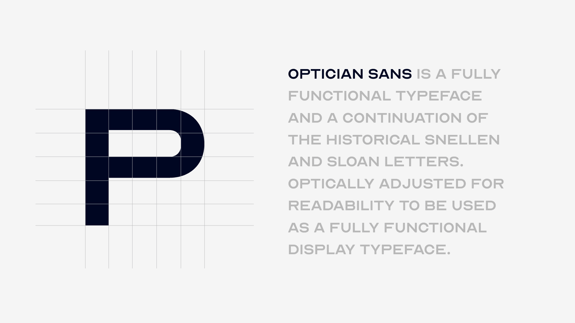
The wordmark uses Optician Sans, a typeface derived from clinical eye-chart letterforms, designed for maximum optical clarity. The choice isn't arbitrary: it connects Prism's identity to the act of seeing clearly, a throughline that runs from the brand name to the scientific precision of the facility.
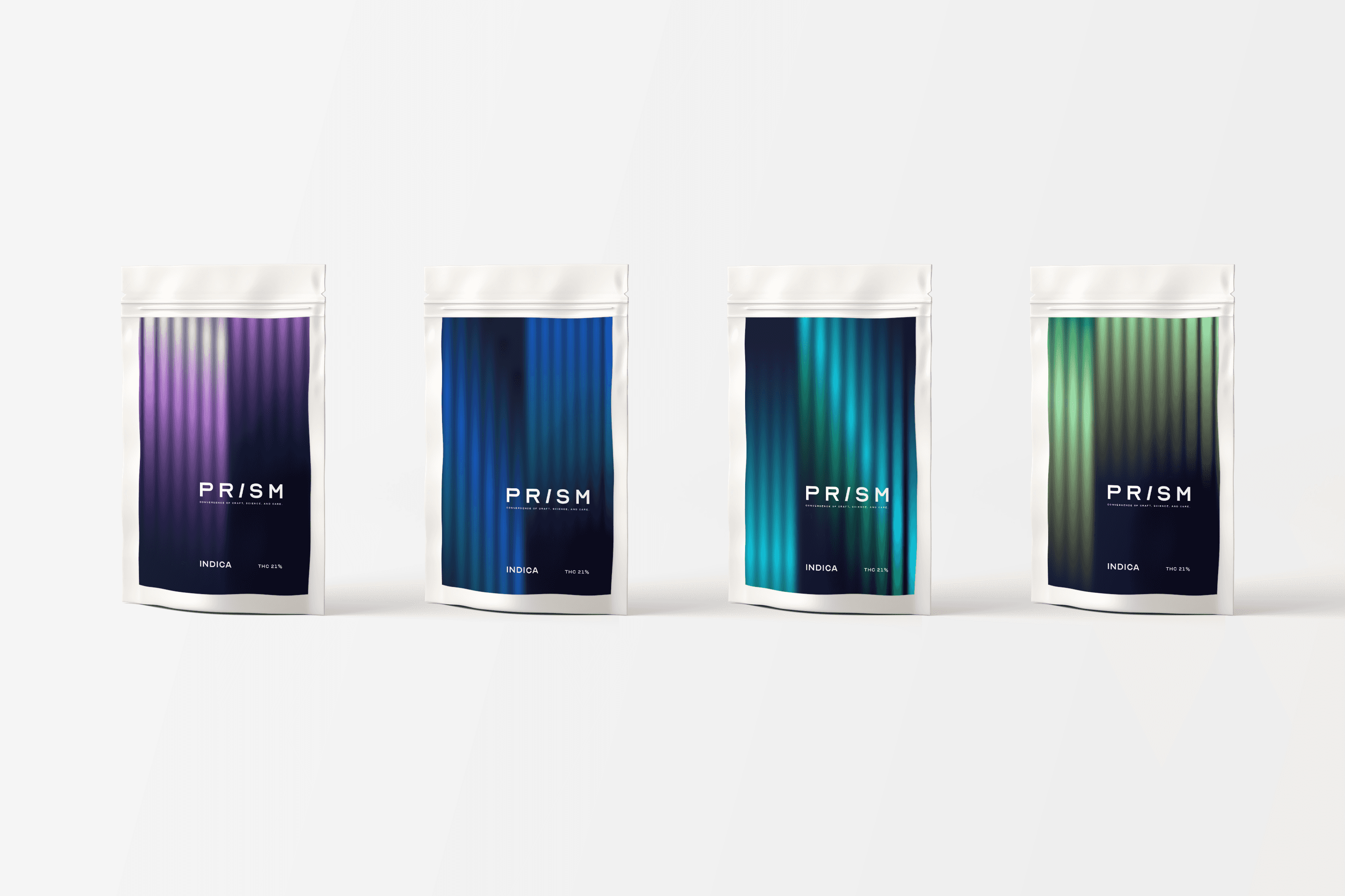
The slash replacing the "I" in PRISM is the brand's signature device. Cut at a deliberate 75°/105° angle the "Prism Angle" — it carries a spectral gradient running from violet through cyan to olive green, the precise color range that appears when white light passes through a prism. What looks like a typographic decision is also a miniature physics demonstration.
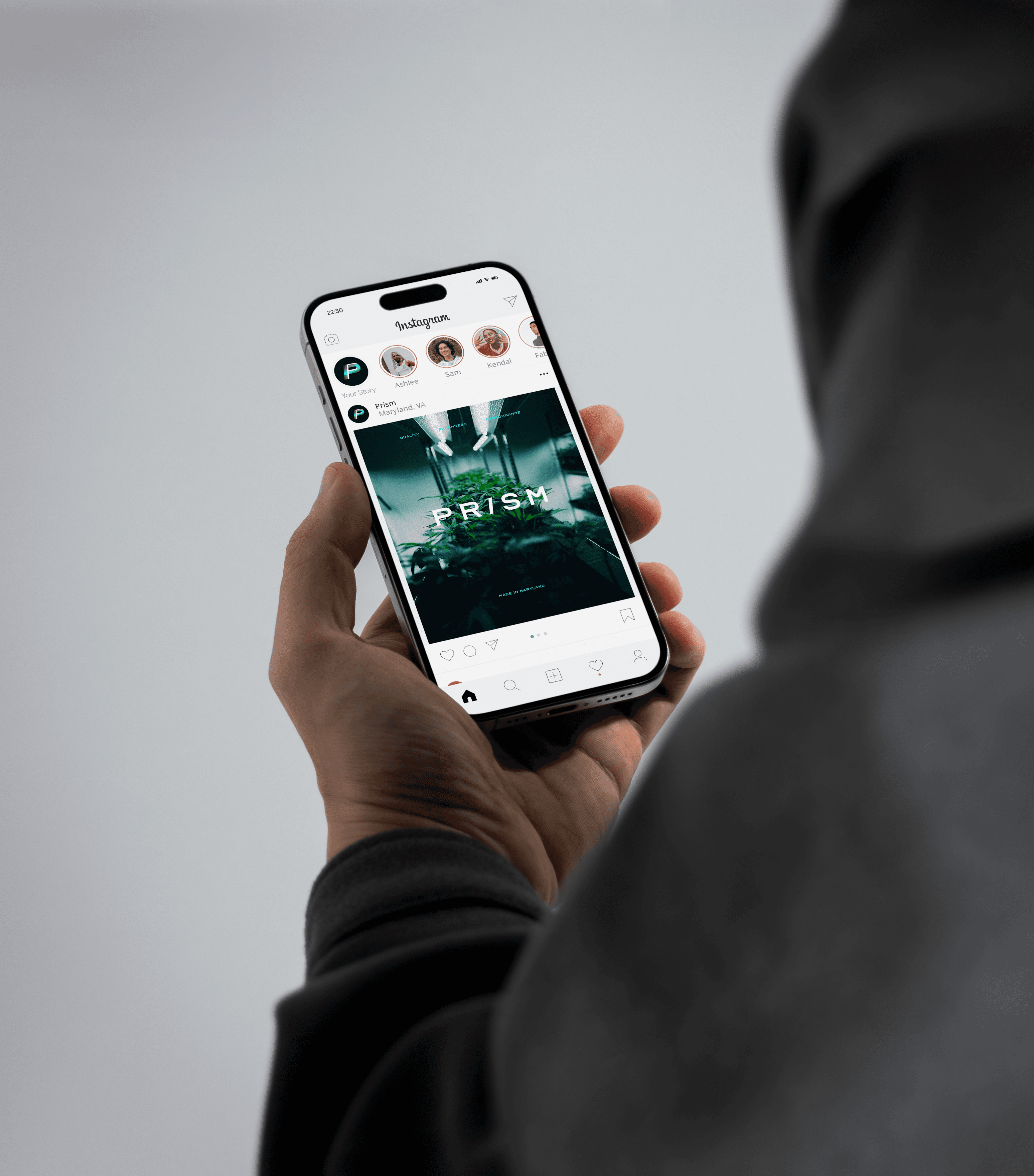
The standalone P mark was developed by merging the letterform with that same angled slash, creating a logomark that works independently at small scales for social icons, packaging, and business cards while remaining unmistakably part of the same system.

The result is a brand identity that earns its premium positioning at every touchpoint. The packaging concept demonstrates how the spectral gradient system extends naturally across product lines. The business card system shows both founders — Katia Fortune and Jessica Lewis — within a unified visual world. The layout examples prove the system is generative, not prescriptive: the same design language produces an educational infographic, a bold editorial spread, and a clean product listing without strain.


1/4


GYMSHORTS
Sarah's Home
New City, New York
2025
CREDITS
Codie Robinson - Project Manager/Strategist Moises Zamarripa - Creative Director/Designer/Strategist
MORE PROJECTS BELOW


HOME
PRISM PROCESSING
JAM (Just a Minute) is a performance storytelling series that brings artists to meaningful locations for a live performance. It is followed by a mini-documentary about the location, providing insight into the song the artists performed. Each location is chosen to add context and depth to the song and story.
SERVICES
Brand Identity
Design
Strategy
The cannabis processing industry has a branding problem. Most operators communicate quality through familiar clichés such as leaf iconography, earthy greens, and approachable-but-generic packaging that flattens the real story. Prism Processing came to us with the opposite challenge: a technically sophisticated, women and veteran-led facility rooted in precision science and genuine community investment, with no visual language to match.The task was to build a brand from scratch that could operate as a credible B2B partner to multi-state operators while laying the groundwork for a future consumer-facing identity. One that felt premium, trustworthy, and entirely distinct from the category noise.


The wordmark uses Optician Sans, a typeface derived from clinical eye-chart letterforms, designed for maximum optical clarity. The choice isn't arbitrary: it connects Prism's identity to the act of seeing clearly, a throughline that runs from the brand name to the scientific precision of the facility.
The slash replacing the "I" in PRISM is the brand's signature device. Cut at a deliberate 75°/105° angle the "Prism Angle" — it carries a spectral gradient running from violet through cyan to olive green, the precise color range that appears when white light passes through a prism. What looks like a typographic decision is also a miniature physics demonstration.
The standalone P mark was developed by merging the letterform with that same angled slash, creating a logomark that works independently at small scales for social icons, packaging, and business cards while remaining unmistakably part of the same system.

The result is a brand identity that earns its premium positioning at every touchpoint. The packaging concept demonstrates how the spectral gradient system extends naturally across product lines. The business card system shows both founders — Katia Fortune and Jessica Lewis — within a unified visual world. The layout examples prove the system is generative, not prescriptive: the same design language produces an educational infographic, a bold editorial spread, and a clean product listing without strain.

1/4

CREDITS
Codie Robinson - Project ManagerMoises Zamarripa - Designer/Strategist
MORE PROJECTS BELOW

WORK
ABOUT
SOUN© is a full service creative studio that focuses on strategy and production services in the realms of film, photography, and design. We operate at the intersection of art, technology, and most importantly -- storytelling.
NEW YORK, NY
VER: 2.0